People Have Character, Companies Have Brands

"Your brand is the single most important investment you can make in your business."
- Steve Forbes
A brand is more than a logo
A brand is your story, what you stand for, what you say, and how you say it. It's all these components working in unison that carve a place for you in peoples' hearts, minds, and eventually wallets.
Now ask yourself, is your brand all it should be?
At Plinth we combine insight, business strategy, and design to turn businesses into brands that stir curiosity, drive loyalty, and induce desire.
A recent brand make-over

Ozumo
Refreshing a Brand with a Successful 15 Year History
Branding, Design, Verbal Identity, Website
Ozumo has been an institution in San Francisco's culinary scene for 15 years. Ozumo came to Plinth because they wanted to give their website a new look and feel but what they really needed was a new brand.
Their original branding made them look like their competitors rather than highlight what sets Ozumo apart.
BEFORE
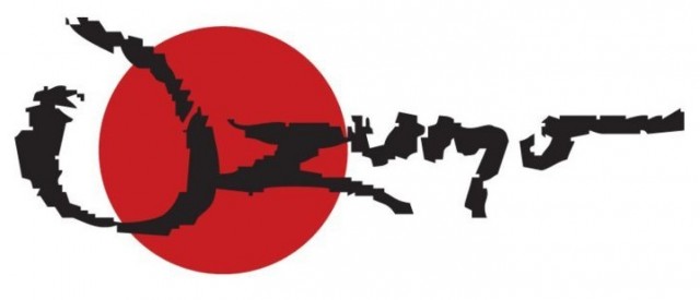
Ozumo's original branding featured elements common to many Japanese restaurants. The logo had a red sun, a brush scripted word mark, and their tagline "Contemporary Japanese Cuisine".
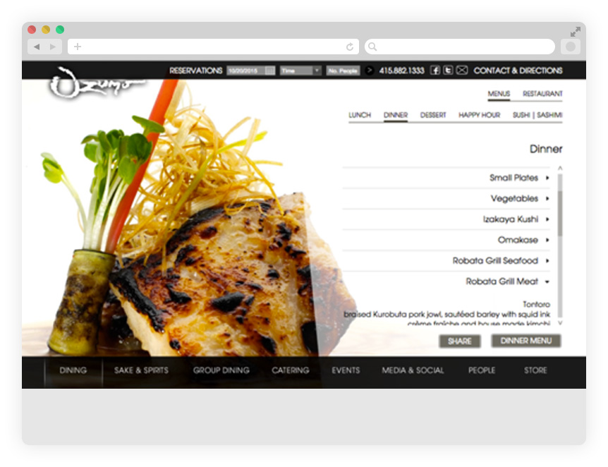
The website featured close up photography of their food against a sterile white background with navigation buttons surrounding scattered throughout each page.
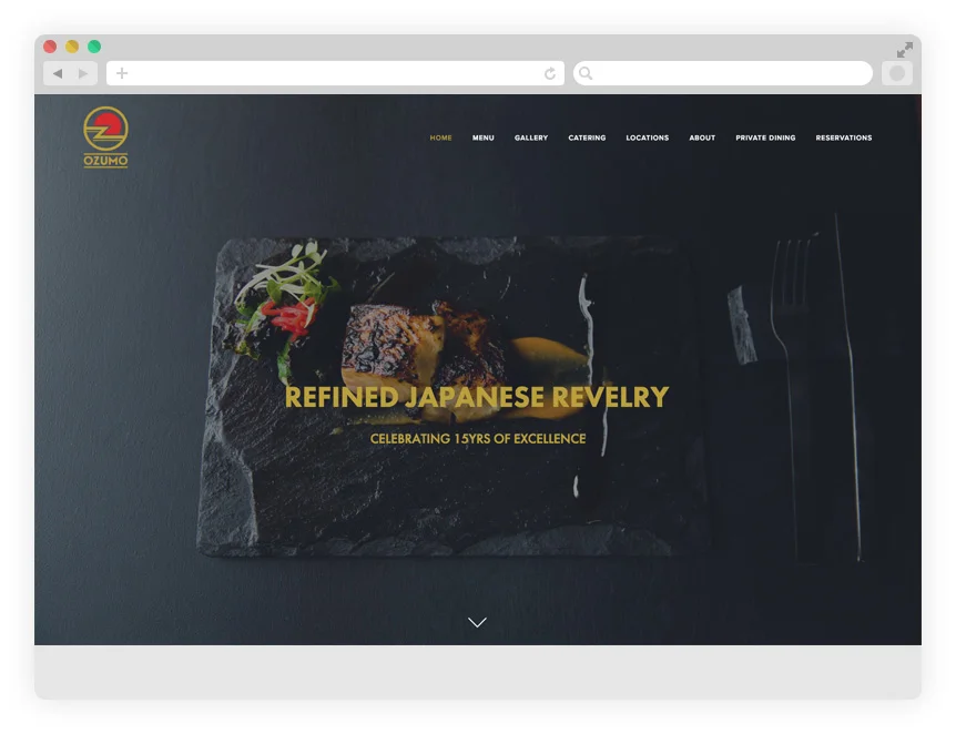
After
Positioning
The first step in refreshing Ozumo's brand was to speak with company's management and distill the brand's core values. From our research and strategic discussions, we came to the conclusion that the Ozumo experience was no longer about "Contemporary Japanese Food". The real Ozumo experience is about a finely crafted evening of indulgence and we evolved their brand to own this new positioning.
15 Year Annivesary Video
Ozumo's Sake Program
Visual Identity
Our design challenge was to find a way to evolve the brand while keeping some elements of Ozumo's rich history. For the logo, we created a modernized version of a traditional Japanese family crest called a "Mon" while incorporating Ozumo's red sun and "Z".

We chose a deeper red and gold as their primary colors to better signify modern luxury and indulgence. The new logo and work mark was also designed so that it would work well with other design applications.
Food Photography
We art directed the Werehaus to shoot food and lifestyle photography which highlighted great times and culinary technique.


Verbal Identity
While a new design language affects how people see a brand, it's equally important to establish a verbal identity to ensure your brand gets heard. We updated Ozumo's tagline from "Contemporary Japanese Cuisine" to "Refined Japanese Revelry" to reflect their new positioning. The copy on the website focused on conveying the complete experience instead of solely on food.


Website
Ozumo's new website was a big departure from the original one. This time, black is used as base color to give it a more sophisticated feel while allowing the food photography to pop.
The new website is optimized for mobile and the simplified navigation makes it easier for users to learn about the menu and book reservations.