The Athletic Club: A Website and Branding for Oakland's Newest Sports Bar

When You Have a Formula for Success, Your Branding and Website Can Spark Your Growth or Hold You Back.
BACKGROUND
The San Francisco Athletic Club (SFAC) is one of the most popular sports bars in the city. It's not uncommon to see people lined up around the block to get in to enjoy the game.
The "vintage gym" feel of the space does more than separate them from your typical sports bar, it creates a more welcoming vibe that appeals to both casual and die-hard sports fans.
With the success of the SFAC, owners Miles Palliser and Ezra Berman decided it was time to expand their business with a new location in Oakland. The veteran restauranteurs came to Plinth to extend their brand and create a new website for their 2nd location.
OBJECTIVE
Develop a unique identity and website for the Athletic Club Oakland while staying true the SFAC parent brand.
STRATEGY
Establish the Athletic Club's brand fundamentals in order to create firm foundation for brand extensions.
Create a design language rooted in the SFAC that can be used in the Oakland location and beyond.
Design an identity system as well as supplementary branded elements for use online and inside the bar.
Develop the Athletic Club Oakland website in a way that that fits within the Athletic Club brand and is easy for employees to update.
Core values AND brand VOICE PERSONA
A brand is more than just a set of colors, symbols, and words. For a brand to effectively resonate with people, it needs to know the values it stands for and have a well defined personality to communicate them effectively.
Prior to starting our design process, we met with the owners of the SFAC to extract what the brand stood for and develop a persona that would define the brand's voice.
LOGO and Identity SYSTEM
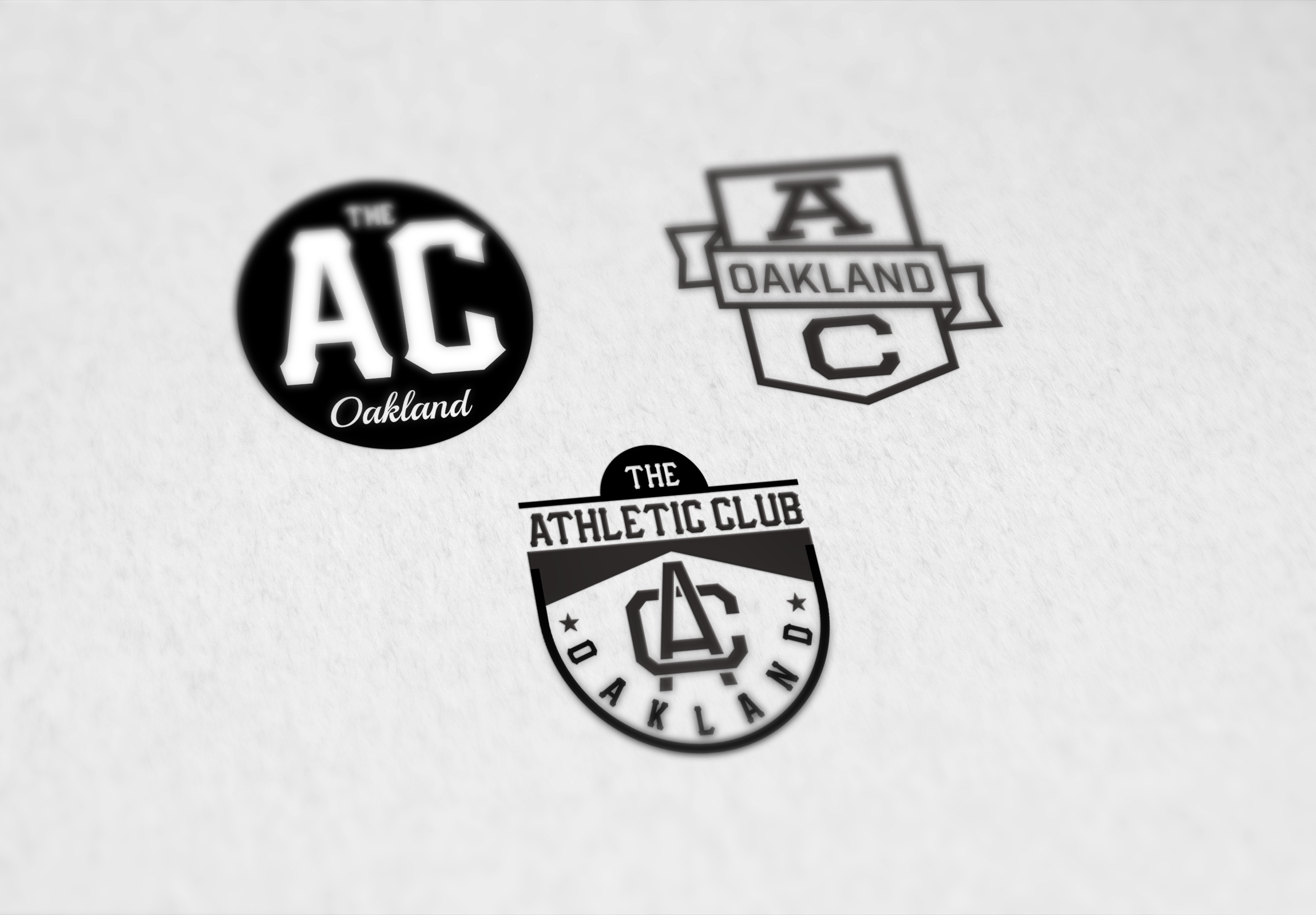
The main logo for the Athletic Club Oakland (AC Oakland) contained a subtle, but meaningful design change from the SFAC logo. We used the same font as the mother brand but brought "Athletic Club" to the forefront.
Putting "Athletic Club" first and the city second better positioned the brand be able to extend to other cities. We also created supplementary designs with the same look at feel to be able to used on apparel and merchandise.
SIGNAGE THAT FITS THE ATHLETIC CLUB'S PERSONALITY
The interior of the Athletic Club Oakland was designed to have an "old gym" feel. The bar is made from a reclaimed high school gym floor and the space is filled with vintage sports items like boxing gloves and trophies.
To help reinforce the brand experience, we designed "championship banner style" flags, posters, and signage.
PAYING HOMAGE TO BAY AREA SPORTS (MINUS THE COPYRIGHT INFRINGEMENT)
The Athletic Club wanted branded decor that would resonate with Bay Area sports fans and avoid getting into legal issues with the teams they wanted to pay homage to.
Our solution was to design "championship style" banners with the Athletic Club logos in the signature colors of Bay Area sports teams.
ATHLETIC CLUB OAKLAND WEBSITE
We designed the Athletic Club Oakland's website to convey the same timeless and nostalgic elements of the brand started by the SFAC. The use of iconic sports photos is continued but are treated with the Oakland location's color ways.
We chose a split screen layout for the interior sections of website. This layout allows the site to maintain brand continuity and still have a section on the right that can easily be edited by Athletic Club employees.


