Developing The Visual Brand For A Japanese Cultural District
Plinth Is Honored To Be Selected For This Important Project.
Background
After successfully helping Japantown Taskforce (JTF) develop the branding for the KOHO Creative Hub in 2021, Plinth Agency was tapped in to help develop a new logo and website for the Japantown Cultural District in San Francisco.
Japantown Cultural District Video
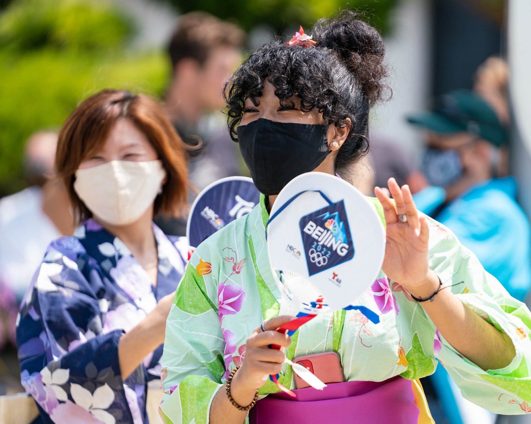
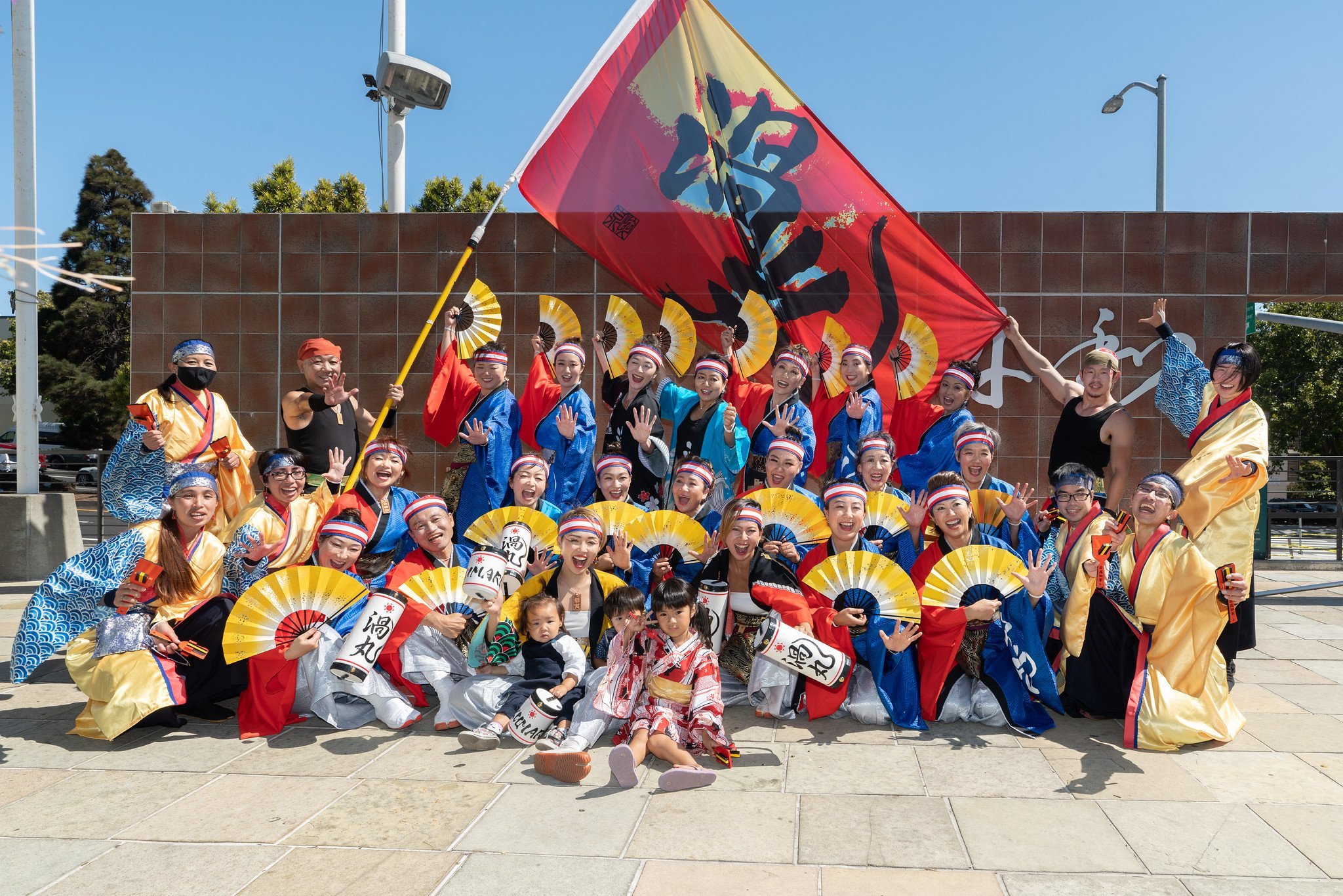
Japantown Cultural District works to preserve a culturally-regenerative, economically-vibrant, and authentic neighborhood who welcomes all, and aims to serve Japanese and Japanese American communities for many future generations to come.
San Francisco Japantown is the oldest and largest of three remaining Japantowns in the nation. Formed in 2018, Japantown Cultural District (JCD), is the first of eight San Francisco Cultural Districts funded by the Mayor’s office of Housing and Community Development to address cultural heritage preservation and work with City agencies “to celebrate and strengthen the unique cultural identities of San Francisco’s neighborhoods; to preserve and promote diverse communities cultural assets and to ensure that residents and institutions thrive and, to formalize partnerships between the City and communities.”
San Francisco was the main entry point into America for Japanese immigrants in the 1800s. After the devastation of the 1906 earthquake and fires, the Japanese community was segregated to the Western Addition, where they created a vibrant community of residents and business owners spanning 40 blocks.
Japantown Cultural District works to preserve a culturally-regenerative, economically-vibrant, and authentic neighborhood who welcomes all, and aims to serve Japanese and Japanese American communities for many future generations to come.
Read more: Japantown Cultural District


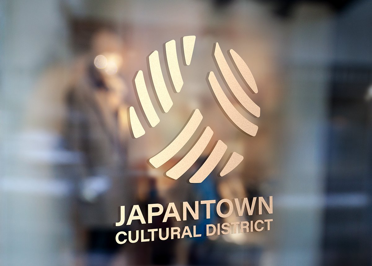
Japantown Cultural District Identity System Takes Inspiration From 2 Elements
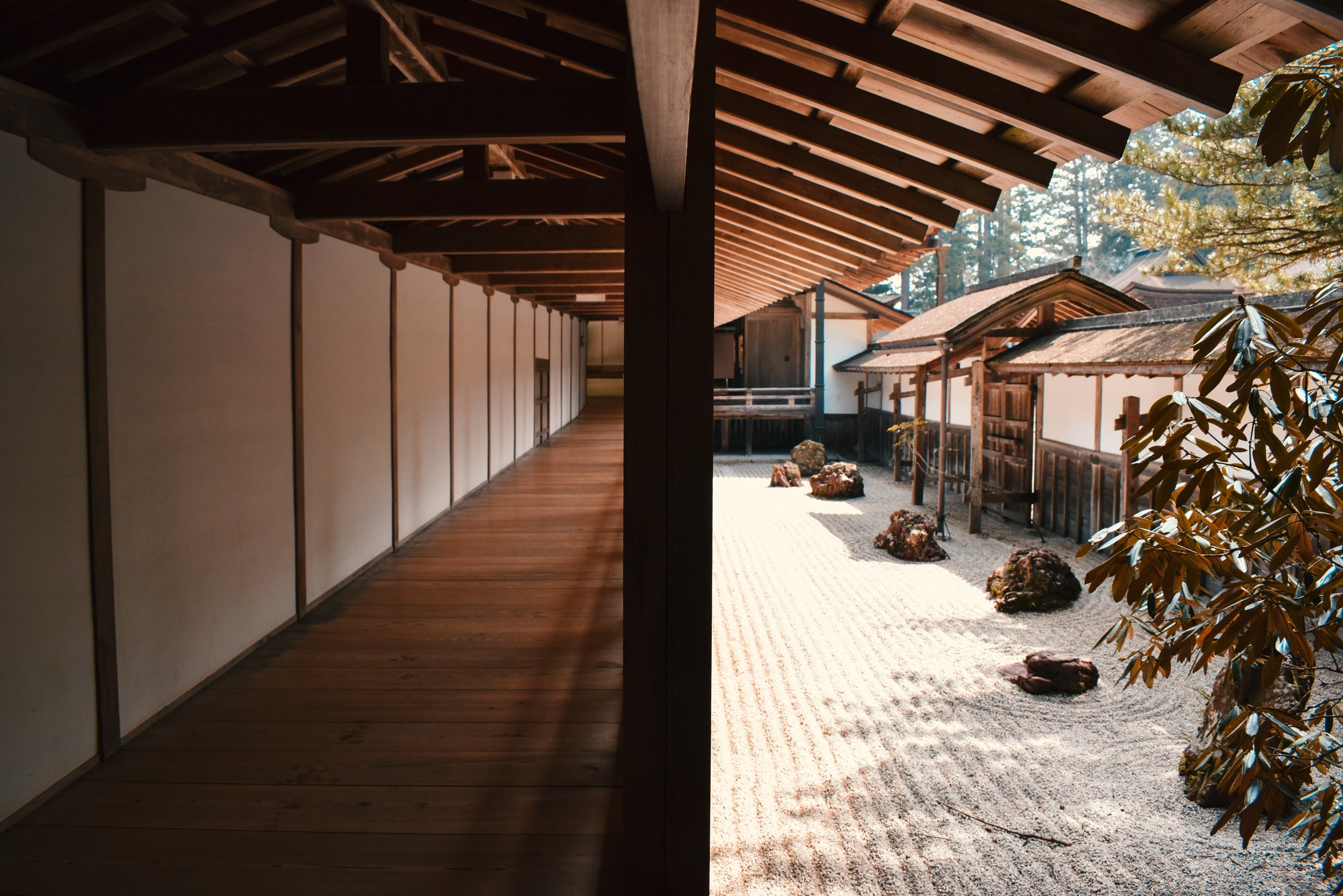
1) The pattern of concentric circles left in sand of a zen garden, and the Japanese character in the center.

2) The bold circular symbol is formed by cropping in on the intersection of marks whose negative space forms the Japanese character “HITO”, meaning “people or person.”
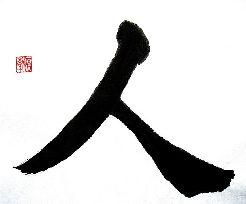
The Japantown Cultural District Logo’s elements contain the circular HITO symbol and the JCD logotype
PLINTH focuses on creating a logo that symbolizes the cultural district while maintaining the essence of Japantown with the color way of deep red, navy and yellow.
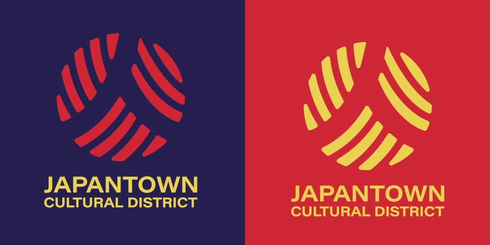
"Color is a powerful means of identification. Consistent use of the primary brand color combinations will help reinforce brand awareness and engagement."
- Andre Sibayan, Plinth Creative Director

Plinth Agency utilizes curation of photography and immersive video to help the minimally designed & easily NAVIGABLE website feel complete.

The mobile responsive website is updated to represent the newly designed logo & brand colors — allowing for a deeper, fuller storytelling experience of Japantown Cultural District.