41 Ocean: From Social Club To Lifestyle

Turning a private social club for the tech elite into a hidden world of lavish events and epic experiences.
Background

Original 41 Ocean Branding
41 Ocean began in 2014 as members only "Club That Compliments Your Lifestyle Of Work and Play". The goal was to entice the tech and entertainment elite to become annual paid members and for 41 Ocean to be a place where they could work and socialize.
41 Ocean's original typography, imagery and language focused on strict membership rules and exclusivity as a main selling point.
With memberships beginning to stagnate and their public events starting to gain popularity, 41 Ocean came to Plinth to develop a new brand and website that would fuel paid memberships without jeopardizing the success of their public club nights.
Objectives
- Develop a brand that resonates with the public while piquing interest in membership.
- Increase paid annual memberships.
- Create a website that is optimized for the mobile experience.
Strategy
- Establish core brand values and re-define 41 Ocean's position.
- Create a new verbal and visual identity to establish 41 Ocean as lifestyle instead of just a meeting place.
- Design an online experience that reflects the new brand and act a focal point for social activity.
Establishing a brand's fundamentals.
Core Values and establishing a new Position
After 41 Ocean's opening, there was a lot of confusion as to who they were. Were they open to public? Were they members only? Was it a workspace? A night club? To help ensure there was no more confusion moving forward, we spoke with 41 Ocean and uncovered the brand's core values.
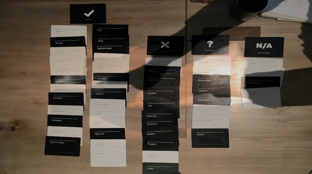

After uncovering their core values we were able establish a new position for 41 Ocean that could resonate with the public as well as pique interest in annual paid memberships. We shifted 41 Ocean from being seen as a low key members only "Club That Compliments Your Lifestyle of Work and Play" into:
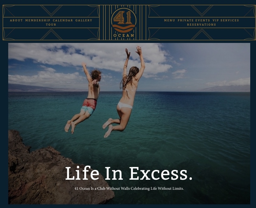
"A Club Without Walls Celebrating Life Without Limits."
This new definition gives cues to 41 Ocean as a night club venue while also signaling 41 Ocean as a lifestyle that members can participate in.
VERBAL IDENTITY
To develop a distinct verbal identity we took inspiration from iconic figures whose point of view matched 41 Ocean's core values of: Indulgence, Inspire Naughtiness, Curate Community, and Style Over Fashion-- or be timeless not trendy.

After a few rounds of editing and distilling, we came up with a tagline to describe 41 Ocean in 3 words:
"Life In Excess."
The new tagline spoke possible paid members as well as revelers who came to 41 Ocean's weekly club nights. Copy in the membership section moved away from displaying strict rules to keep people out. Instead we focused on what membership would would lead to:
"Exclusive access to
a hidden world of lavish events
and epic experiences."
designing a logo that captures the past and future of a brand
The original logo was aimed at making 41 Ocean "A California Club". The typography was meant to illicit a vintage beach / old Hollywood feel.
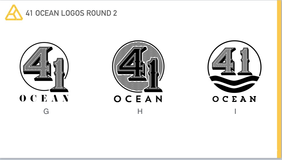
The new logo for 41 Ocean had to represent its new brand while still retaining a touch of its Santa Monica heritage. We designed the new logo to represent timeless luxury, indulgence, with the feel of a speak easy.
A key challenge with designing the logo was that it had to match the rich interior of 41 Ocean. The interior design of 41 Ocean had rich leather couches, distressed signs, with hints of latin influence.
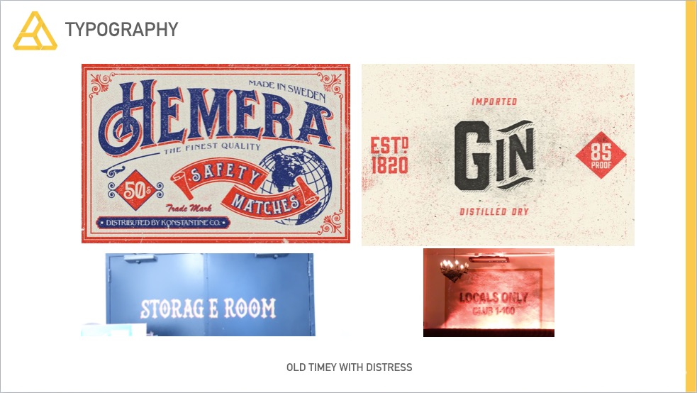
Balancing Typography, color and shape
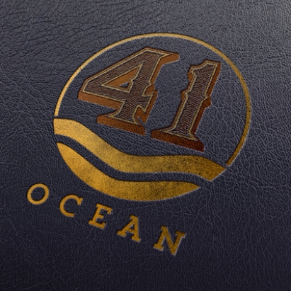
The new typography took inspiration from from vintage Havana posters, old distillery labels, and currency. To pay homage to Santa Monica, we incorporated the circular sun form and waves. We chose rich browns with copper and gold colors to match the interior of 41 Ocean and still give it a luxe feel. The logo was designed so that it could be used as a stamp on menus or signs executed with gold foil.
Designing a web experience that speaks to living "Life in Excess."
41 Ocean is unique. It's a nightclub with a membership program that gives its paid members access to secret rooms, lavish private parties, and access to a social network of thrill seekers.
The web experience had to be just as unique.
ACCESS TO EXCESS
Most people visit the web through mobile devices, but this is especially true when it comes to social interaction.
"The smart phone is the hub of today's social life, so we designed 41 Ocean's website to feel like a portal to an indulgent lifestyle."
-- Desi Danganan, Managing Director, Plinth

We used a photo tile based format for each section of the website to make it feel like a social media feed. Each tile was designed at as sneak peek as to what lies beneath. The tiles also make it easier for people to navigate and click on their phones.
With a new brand and a new website comes new opportunities.

We turned 41 Ocean from a California club that compliments "Your lifestyle of work and play" into "A club without walls that celebrates life without limits." Armed with a solid brand foundation and identity, 41 Ocean is looking to extend it's lifestyle brand into a social app for its paid members.
41 Ocean is no longer represents a place that excludes people. 41 Ocean is now an invitation, a gateway, for fellow thrill seekers to live Life in Excess.
You should be aching to show off your brand and your website. If not, we can help.